Hide and seek
Oftentimes, the success of a new feature comes down to the little things. Where the feature lives within your product, the workflow your users take to get to it, how easy it is to find. It’s generally best practice to give your new feature a little bit of extra love and time in the spotlight—Pendo makes that easy.
When MineralTree launched a new feature in their app, they knew they had a winner on their hands. “It’s a pretty powerful feature in the accounts payable space, all around analytics and tracking financial metrics,” said Jose Garcia, senior product manager at MineralTree.
Garcia and his team initially placed the new feature in a spot within their app that categorically made sense—alongside MineralTree’s other reporting tools. “In theory, where we put the button initially made sense. If people were already on the reports tab, they could click on it and jump to an analytics page,” said Garcia. But in reality, MineralTree’s users weren’t following that same workflow.
Follow your gut—and your UI
Garcia noticed that the placement of the feature was also negatively impacting feature adoption rates. “We didn’t give [the feature] the visibility it deserved,” Garcia explained. But he didn’t have time to wait for development and engineering resources to become available to change the positioning or functionality of the feature. “We needed to make it more visible to our customers, fast. So we kind of just took a stab with Pendo and said, ‘we have this tool, we should try using it.’”
He consulted with MineralTree’s design and UX research teams to determine a better home for the button. Ultimately, the decision was part art, part science. The team evaluated the feature’s traffic metrics and compared their vision to the physical user interface (UI) of the page. “We looked at the dashboard and knew exactly where the feature should go because we already had an analytics visual there,” said Garcia. “It just felt like it belonged.”
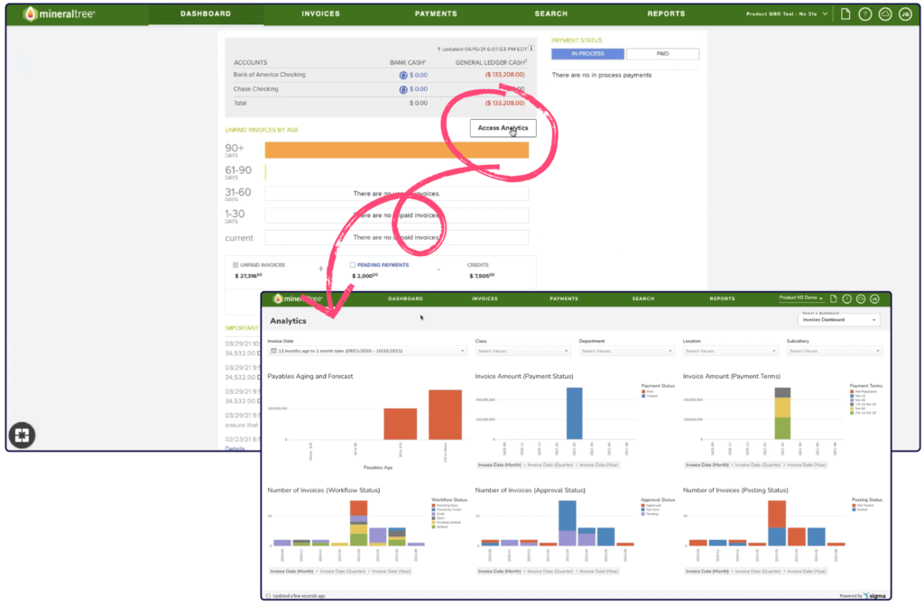
Garcia launched a Pendo in-app guide disguised as a button to reposition the feature within the product—giving users access to it directly from the dashboard page where they first land after logging in. He also styled the button to look like it was part of MineralTree’s product. “This wasn’t the first thing that came to mind—only because we’d only used Pendo guides to make announcements or do one-time campaigns,” said Garcia. “But using an in-app guide in a way where it’s always going to display, with a persistent button hiding the container, is kind of the way we ‘Pendo it’ into our application.”
Garcia and his team have seen incredible results from their efforts so far. “The shift gave us about anywhere from a 75% to 100% increase in the amount of traffic we saw coming to this area,” said Garcia. The MineralTree team is now putting resources towards finding a more permanent solution—but Pendo allowed them to find a fix easily and quickly, while putting their feature on firm footing for success.
Anecdotally, MineralTree has heard great feedback on the change from their customers, who are now able to easily locate the feature. And leveraging Pendo in this way has had a powerful impact for the MineralTree team internally, too. “We use our own product in our internal finance processes,” Garcia explained. “When our CEO saw [the button], he was so happy and pumped that it was there. He said, ‘this is the thing that I used to have to click three times to get into, but now it’s right here when I log in.’ Hearing that from our own team was awesome because we knew we hit the mark.”