New! Enhanced Retention Analytics for Features, Pages, and Portfolios
What’s new with retention?
Over the last few months, we’ve been hard at work delivering enhancements to Pendo’s Retention Analytics. Here’s a summary of changes, with a full explanation in the post below.
Feature and page retention: Now you can isolate specific parts of your app, and view how well an individual feature or page is able to retain users who use it for the first time.
View retained and dropped visitors: It’s interesting to know that 75% of users in month one came back in month two, but it’s useful to know the names of the 25% who dropped off. Pendo lets you do both, and export this list to a CSV.
Multi-app aware: Compare and contrast how each part of your product portfolio is able to retain users, and run experiments between and across apps to learn how you can improve retention.
What is retention analytics?
Also known as ‘cohort analytics’, retention analytics is a key method to measure growth of SaaS and digital products. Retention looks at first time users within a specific timeframe (typically one month or one week), and calculates the percentage of those users that return in subsequent time periods. At the highest level, retention is looking at user logins, and you can segment by any behavioral or demographic info to get a very specific look at retention across different personas within of your user base.
Retention analytics can be used to answer questions like:
- What is the overall retention of my product?
- How does retention vary between segments and personas?
- Which features are correlated with a retained user?
- Which user acquisition channels have the best and worst retention rates?
- Is my new feature able to not just attract attention, but encourage habitual use?
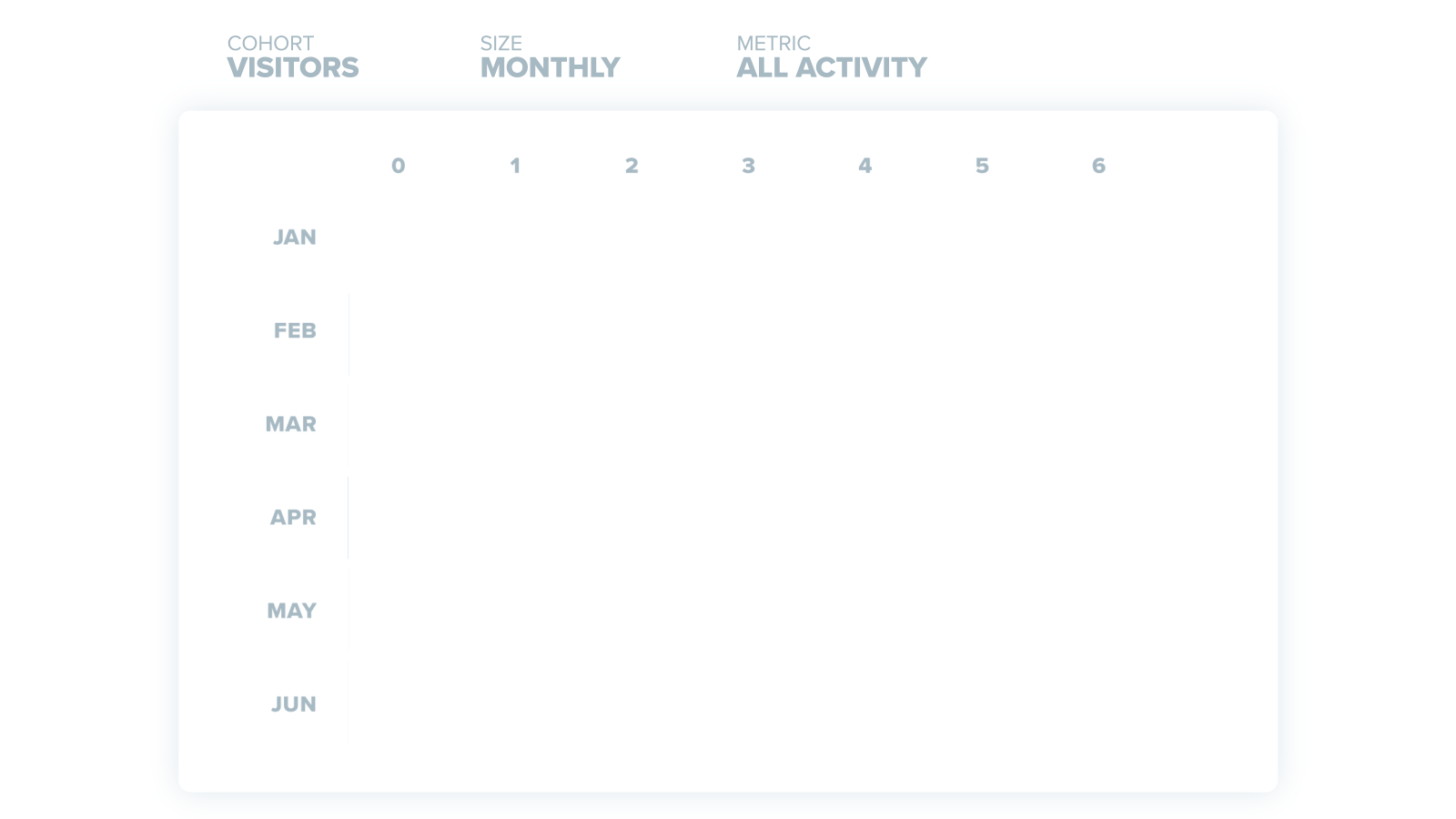
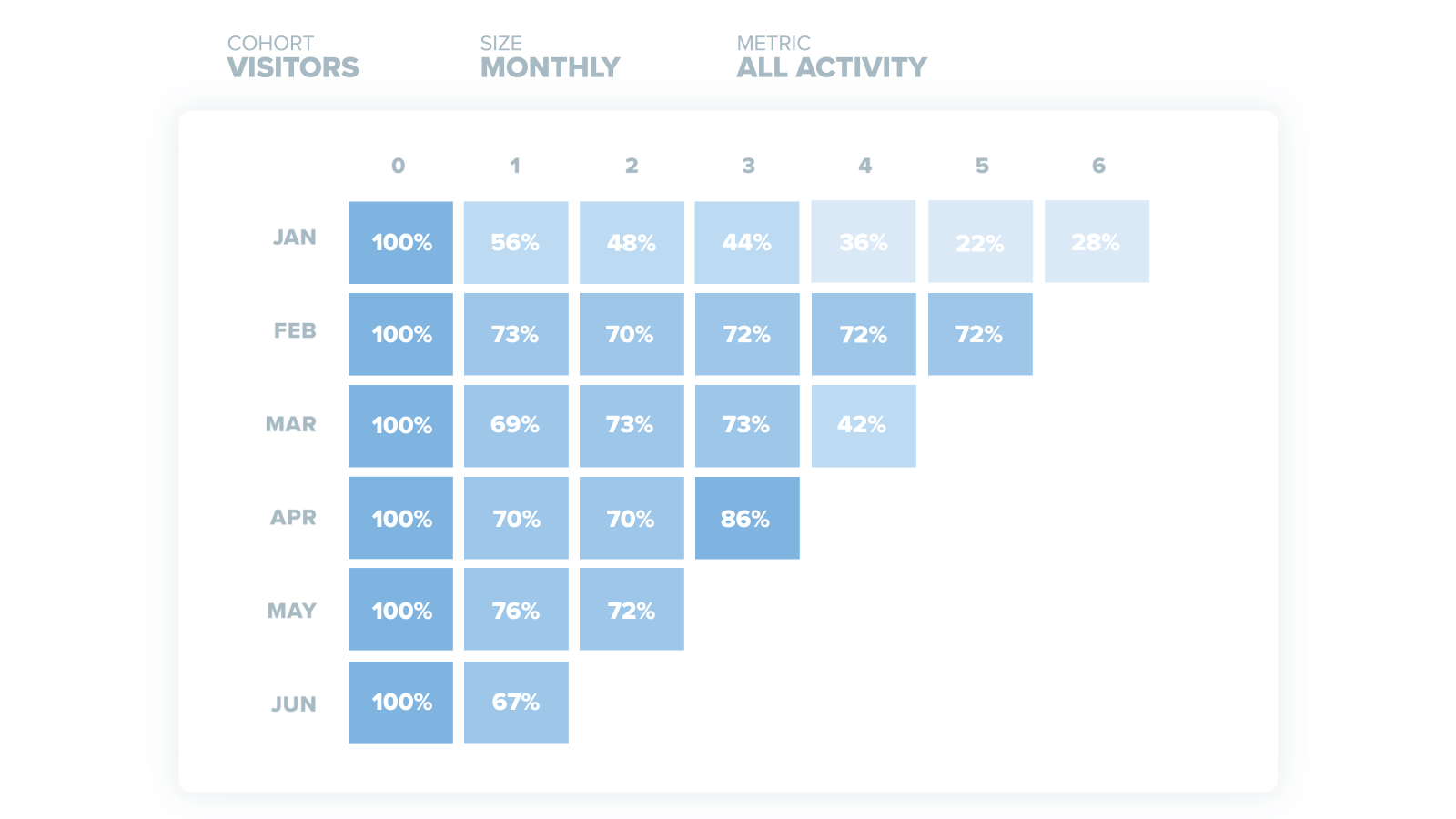
How to read the retention chart
Each row represents a cohort, defined as all the first time users within a given time period. In the GIF below, as you move from top to bottom, each row will represent first time users in Jan, Feb, March, etc. Each column is a discrete time period, representing the number of months since the start of that cohort. Finally, as you move down the chart the cohorts get younger, so the row is shorter.
Returning vs Dropped Visitors
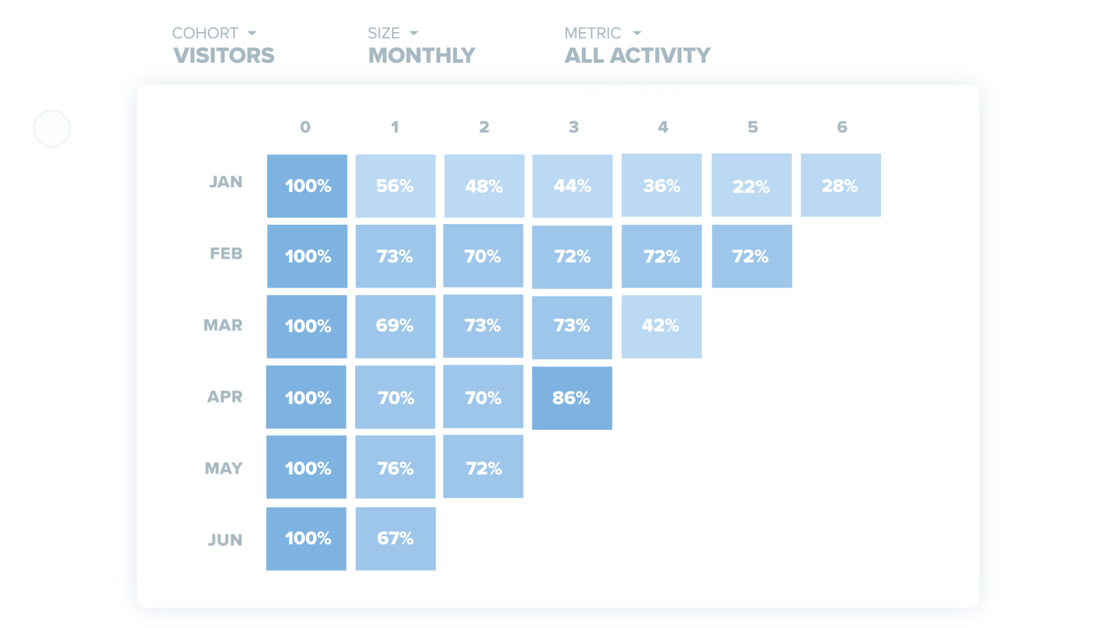
It’s great to know the rate of return, but if you want to do something to re-activate those dropped users, you’ll need to know who they are. Pendo makes it easy to see the returning users and dropped users for any period, and export those contacts as a CSV.
Zoom in to feature or page retention
Looking at retention at a macro level (i.e. whether or not someone logs into your app) is interesting, and gets even more useful when you zoom in to retention on a particular page or feature. Just as new users are trying your app for the first time, your existing users are discovering new parts of your application every day. It’s equally important to look at an individual feature’s ability to find and keep it’s audience as it is to measure your app as a whole.
High retention features can indicate strong points of activation for your users and areas you may want to drive new users towards during onboarding. Conversely, features you know are high value but have low retention are where you want to steer your attention for guides and in-app tooltips to help users get traction.
Measure retention across your entire portfolio
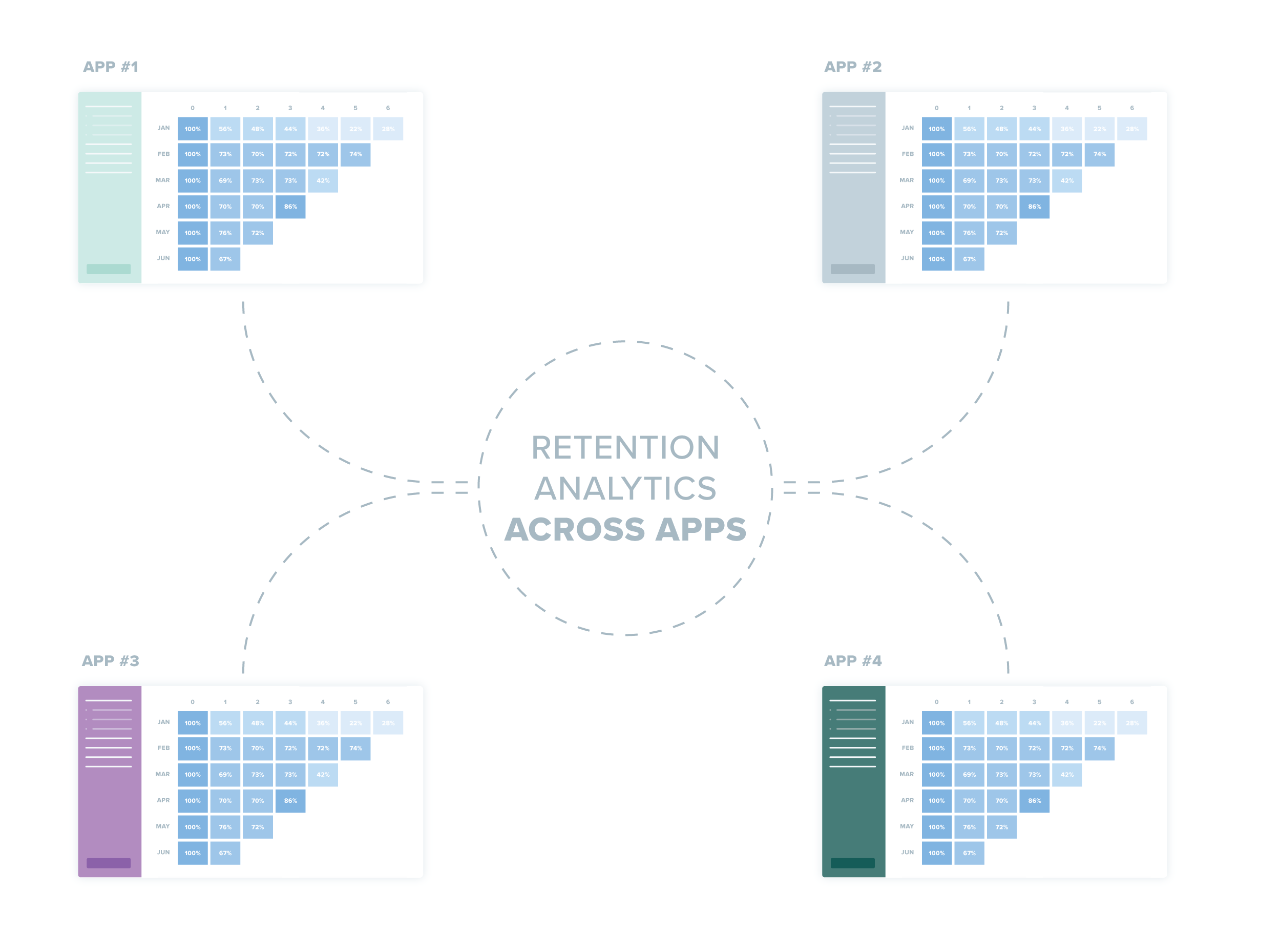
Finally, if you manage a portfolio of apps, Pendo’s retention analysis is multi-app aware, so you can compare retention rates across all the products in your purview. Is one of your apps outperforming or underperforming the rest of your portfolio? Learn what’s working well to implement across your other products, experiment with different ways to improve retention, and benchmark the progress of each application against your own portfolio.
These new enhancements to retention allow you to zoom in to specific parts of your product, zoom out across your entire portfolio, and see the returning/dropped visitor details for any retention cohort. Already, beta testers have used this functionality to better understand their new feature launches, or how UI changes impact the ‘stickiness’ of specific parts of their application. We hope you’ll find it useful as well, and look forward to your feedback!
NOTE: These enhanced retention capabilities will be rolling out to general availability in waves over the coming days. If you have any questions, please contact your success and support teams.