
Here at Pendo, we are very focused on our NPS. Our NPS responses are sent to Slack in real time, where everyone in the company tracks and dialogues about them. Some of these conversations were so impactful, they led us to investigate the NPS scores of specific segments of users (e.g., read-only users) and build strategies to improve their product experience.
Our NPS tool is one of my favorites at Pendo, because it combines multiple types of data into one insightful graphic: product usage, NPS rating and sentiment, account information, role, etc. Tracking the fluctuations in our NPS, monthly and weekly, allows us to monitor trends in our NPS. It is important to understand the variance in NPS, especially around known events (holidays, for example). Even though NPS is a lagging indicator of customer satisfaction, and it surveys the user based on their overall product experience, it can still allow us to assess the downstream impact of enhancements in specific parts of our product or new feature launches.
I analyze our NPS data frequently to check for any emerging or aggregate trends in our customer sentiment and usage, especially as our product and customer base continues to change and grow. We survey our users twice a year. With over a year-and-half of NPS data, I recently investigated how the ratings (and responses) of our repeat responders and accounts had changed, if any, over the years.
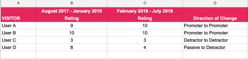
I filtered out the NPS responses of users (and accounts) who had answered our survey at least twice. I used their responses from the first survey period and then the second (in our case, 6 months later), to record the direction of change. For example, a user who gave us a rating of 8 the first survey period and 9 the next would fall under the change category “Passive to Promoter”. I then summarized the changes in each category (counts and percentages), as shown below.
Shown below is the percentage of responders in each change category (the signs assigned here indicate the direction of change of response for ease of viewing). The ideal situation is those who are detractors (and passive responders) of your product turning into promoters. Equally important is ensuring that your promoters stay promoters.
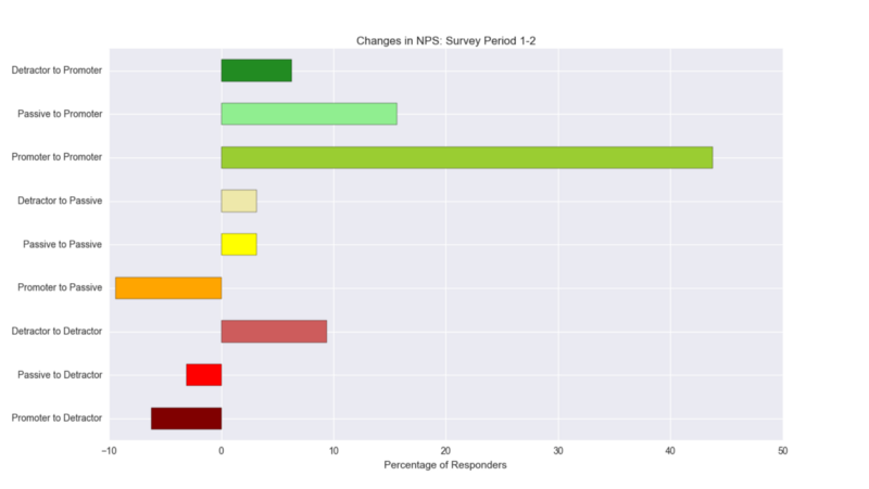
But particular attention should be paid to the group of responders who move from being passives/promoters to detractors; you certainly do not want them to constitute the majority of your data. An essential caveat to all of the above is, of course, digesting these insights within the context of your NPS survey response rate and user homogeneity (role, response level, etc.).
In our case, we were able to distill valuable insights from the text responses provided: for example, is there a common theme in feedback (“guides”, “analytics”, “performance”) from those who turned detractors? Being able to tie the differences in product usage, in the 30 days prior to when both the responses were recorded, back to the sentiments of the users yielded important context around usage patterns. If your users haven’t already given you feedback, reaching out to them to understand their direction of change could prove highly useful. For more guidance on analyzing your NPS responses, be sure to check out our NPS resources.